…or at least the blogosphere:
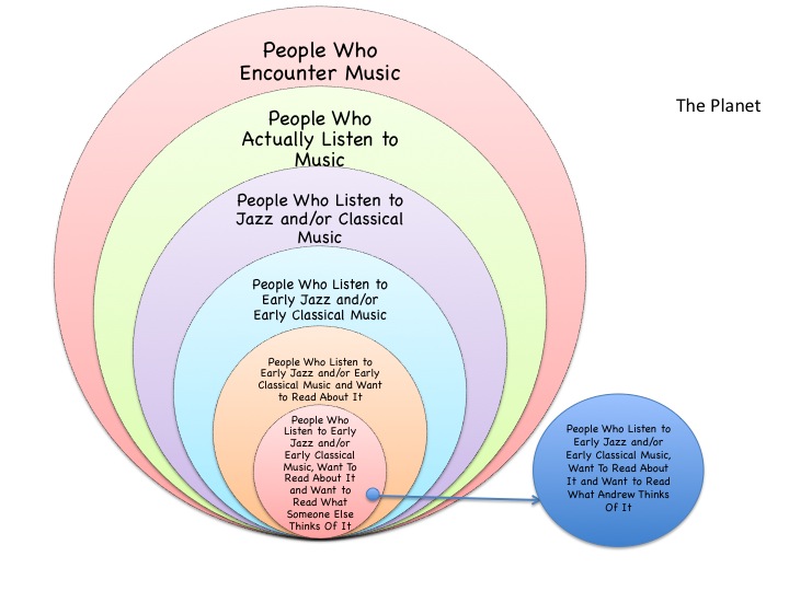
The taxonomy (or is it a Venn diagram?) may be right but the proportions are all off. The blue dot is much larger from my perspective.
Technically, it is a stacked Venn diagram, and quantity of viewers is not necessarily directly proportionate to the quality of readership. I am happy for my little slice of the web!
We can be thankful that popularity doesn’t determine the extent to which something is worthwhile/enjoyable!
Man, your support means the world to me. Thank you.
It’s been a pleasure to share this little circle of Hell with you.
Tell me what you really think/thought about it, Paul! All kidding aside, the pleasure is mutual.
Comments are closed.

The taxonomy (or is it a Venn diagram?) may be right but the proportions are all off. The blue dot is much larger from my perspective.
Technically, it is a stacked Venn diagram, and quantity of viewers is not necessarily directly proportionate to the quality of readership. I am happy for my little slice of the web!
We can be thankful that popularity doesn’t determine the extent to which something is worthwhile/enjoyable!
Man, your support means the world to me. Thank you.
It’s been a pleasure to share this little circle of Hell with you.
Tell me what you really think/thought about it, Paul! All kidding aside, the pleasure is mutual.